
The dashboard makes it simple to organize data in the form of KPIs and gives the data a structure in the form of graphs, charts, and many other visual representations. Isn’t it an excellent feature of Google Sheets to create beautiful and simple-to-understand data in visual formats for all these similar features to turn a piece of data into charts and graphs? Let’s examine how to create a dashboard using simple data conversion in the form of charts and graphs.
We will carry out this procedure step by step.
1. Selecting a data collection
We collected sales information for the items mentioned from (A to H) on the sheet with the title Dashboard; the next step would be to create the dashboard.
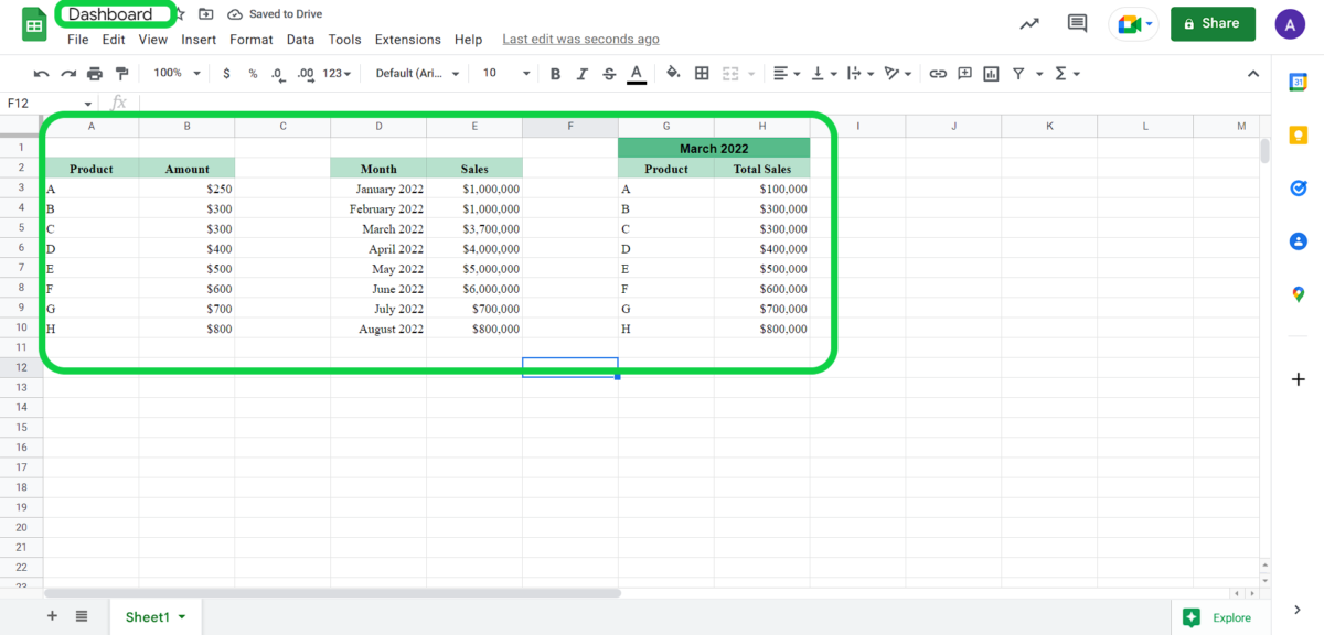 Screen 1: Sales data
2. The Dashboard Area
For the dashboard, we want a specific area, thus we must shift our data and create room at the top.
Screen 2: Space for Dashboard3. Inserting Graphs and Charts
We had to choose our data and then click the “insert” option to add graphs; within the insert option, we had to select “chart” to turn the data into a chart.
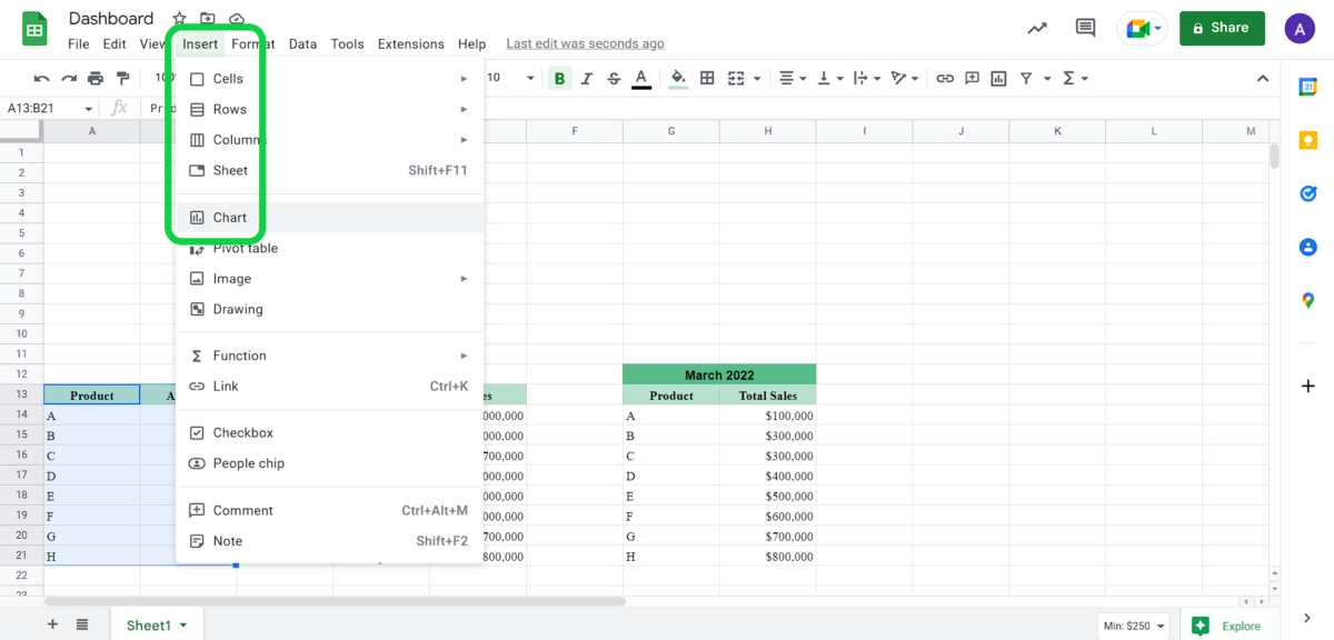 Screen 3: Inserting Charts
4. Editing the chart as necessary
You can see a chart that Sheets automatically created on screen 4; we also have a “chart editor” option that allows us to make changes to the chart.
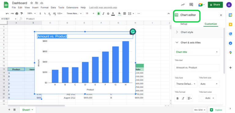 Screen 4: Chart Editing
5. Give the Dashboard a name and include other graphs.
To include graphs for another data set, we will repeat step 3. As you can see in screen 6, we named our dashboard “PRODUCT SALES DASHBOARD.” You can name your dashboard similarly.
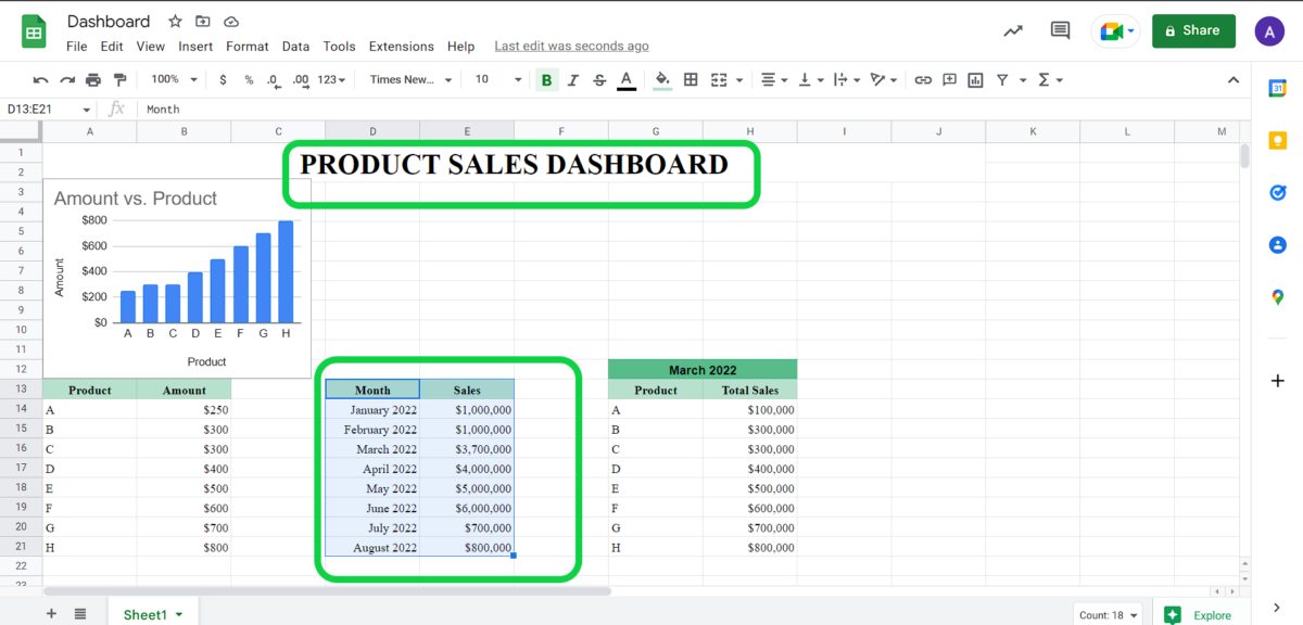 Screen 5: Naming Dashboard
6. Selecting a different type of chart
For the second set of data, we selected a “Pie chart” from the editor’s many available “chart type” options.
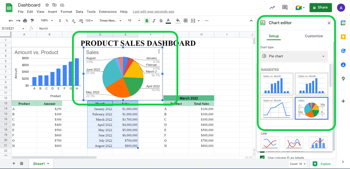 Screen 6: Chart Types- Pie Chart
Similarly, we selected a line graph for the third data set (screen 7).
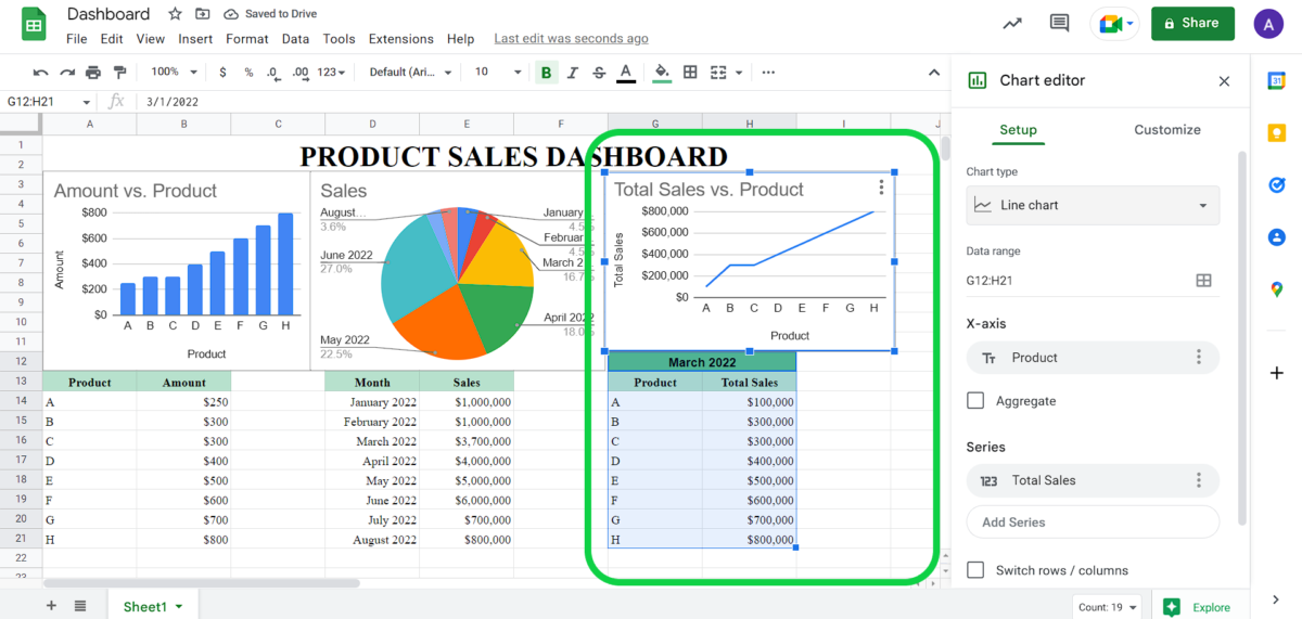 Screen 7: Line Graph
7. Final setup
Finally, you can see in Screen 8 how we created the final dashboard; it was a simple and enjoyable process.
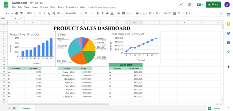 Screen 8: Final dashboard screen
Tags:
- #Google Spreadsheets